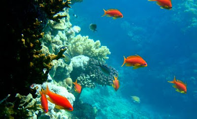
The original photograph
with my signature color Blue Green.
So I started out with my photograph. I selected an image that was composed of my signature hue but also included a contrasting (complementary) color.
I followed all of the suggestions to simplify photos and group colors, so that the color palette based on the photograph would be more evident.
The Median output seemed to make the colors coagulate the best. I thought at first that a Mosaic treatment or even a Crystallize treatment would separate the colors better, which they did, but the separation created so many tints, tones and shades in between, and I don't want to go crazy manually noting down the color codes of each square or fragment.
From the color separation done in Photoshop, I went to the more hands-on task of calculating the proportions of the most distinct colors in the image in Illustrator.
Here's what I did:
1) I set guides on the edges of the image, breaking it afterwards in halves, and plotting the guidelines there accordingly.
2) Then, I assigned a spectrum of greys and recreated the same plane using a square as the smallest unit of measure.
3) Since I have two colors occupying 50% of the picture, and nearly 25% of the picture, I simply divided 25 into 8 to determine what percentage a square occupies. One square is 3.125%.
4) I enumerated the rest of the proportions based on the types of shapes formed: a square, a half-square (triangle), two squares, three squares.
5) Then, I represented the %'s in a strip and in circles, scaling them according to the numbers I obtained.
Who knew that the way to arrive at this artistic representation is by using the scientific method? Thank God I listened to my high school teacher.


No comments:
Post a Comment