Monday, March 29, 2010
Pitter-Patterns
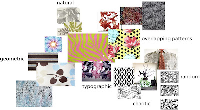
Here's a website that acts like an image database of print patterns that one can buy, or one can upload to and sell!
I found my homework answers right here, too.
1 - inspired by nature, but chaotic and random in print, click here.
2 - geometric pattern, (very Albers, too) click here.
3 - photographic, freeform or based in type, 2 patterns together, kaleidoscopic, click here.
Monday, March 22, 2010
The Next Secret Weapon

Maybe we should develop a Crayola bomb as our next secret weapon.
A happiness weapon. A beauty bomb.
And every time a crisis developed, we would launch one.
It would explode high in the air - explode softly
- and send thousands, millions, of little parachutes into the air.
Floating down to earth - boxes of Crayolas.
And we wouldn't go cheap, either - not little boxes of eight.
Boxes of sixty-four, with the sharpener built right in.
With silver and gold and copper, magenta and peach
and lime, amber and umber and all the rest.
And people would smile and get a little funny look on their faces
and cover the world with imagination.
Robert Fulghum
What Will It Be?

The essence of the blue-green that I want to put forth in the book is really about paradise. The story that I wove before was about a moment that took place in a kind of "paradise". And, all the photos that I've been lucky to find in the net are of the beach, whether it was taken professionally (or with a professional camera) or a polaroid (which when kept for a long time fades to either cyan, magenta or yellow, depending on the percentage of color used).
I don't want the book to be a series of just beaches. I want to capture what paradise means. Is it always just about the water? Can it be about an object? A picture? A person?
This is where I am at, and I'm confused. Maybe I should just toss a coin.
Catching the Blues (Blue Greens)
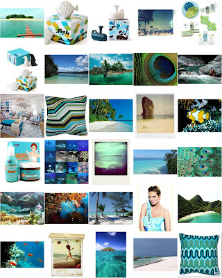
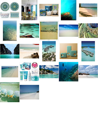 This is one collection of the blue-greens in images I've mined on the net. Unfortunately, and frustratingly enough, there are not a lot of blue-greens around in real life (here in the city) yet. There is cyan, though, but I have been holding out on a combination of blue and green. I see it fleetingly on a scarf, or a shirt, or a bag, or a beauty product, or a salt shaker. They don't evoke the blue-green essence that I want to capture - paradise.
 The concepts swimming in my mind for my color book are:
paradise
forgotten paradise
untold paradise
secret paradise
captured paradise
exotica
hidden exotica
secret waters
quench
waters of eden
eden
liquid eden
exotique
secret exotic
Photo Paletting: Actually, It is Rocket Science
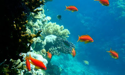
The original photograph
with my signature color Blue Green.
So I started out with my photograph. I selected an image that was composed of my signature hue but also included a contrasting (complementary) color.
I followed all of the suggestions to simplify photos and group colors, so that the color palette based on the photograph would be more evident.
The Median output seemed to make the colors coagulate the best. I thought at first that a Mosaic treatment or even a Crystallize treatment would separate the colors better, which they did, but the separation created so many tints, tones and shades in between, and I don't want to go crazy manually noting down the color codes of each square or fragment.
From the color separation done in Photoshop, I went to the more hands-on task of calculating the proportions of the most distinct colors in the image in Illustrator.
Here's what I did:
1) I set guides on the edges of the image, breaking it afterwards in halves, and plotting the guidelines there accordingly.
2) Then, I assigned a spectrum of greys and recreated the same plane using a square as the smallest unit of measure.
3) Since I have two colors occupying 50% of the picture, and nearly 25% of the picture, I simply divided 25 into 8 to determine what percentage a square occupies. One square is 3.125%.
4) I enumerated the rest of the proportions based on the types of shapes formed: a square, a half-square (triangle), two squares, three squares.
5) Then, I represented the %'s in a strip and in circles, scaling them according to the numbers I obtained.
Who knew that the way to arrive at this artistic representation is by using the scientific method? Thank God I listened to my high school teacher.
When Blue Green Meets Red Orange

Step 1:
Create a 4-step tinting gradation from Blue Green at 100% hue, at the L-most column.
Step 2:
Create another 4-step tinting gradation from its complementary, Red Orange, at 100% hue, at the R-most column.
Step 3:
Create a mixture of Blue Green and Red Orange that is "cooler". Place this on the column next to the Blue Green.
Step 4:
Create another mixture of Blue Green and Red Orange that is "warmer". Place this on the column next to the Red Orange.
Observation:
This 4x4 matrix was quite a challenge for me. Of all the steps, I took the longest in steps 3 and 4. I was already comfortable developing the right hue to represent blue green, and tinting it in 3 other steps was truly not that difficult. But steps 3 and 4 were mixtures, and it was up to my eye to gauge its temperature, and its logical tint when white is mixed in increasing amounts.
Generalization:
Although it doesn't scan well, column 3 from the L (the mixture close to Red Orange), produced rather earthy, muddy shades of brown. I was so surprised to find out that the base colors of my comforter was blue and orange, two of the colors I least use and prefer! Thinking it was "mocha", I automatically partner shades of that brown with baby pink - for that dessert cake feel. No wonder when I put up (and took down) a cyan colored poster it felt appropriate!
Another thing I realized is that I often select colors that are combinations of complementary colors, after all. To me, they're all just "muted" or "neutral" which I often gravitate to rather than the bold and bright. But this has awaken me to the knowledge that I don't prefer cool or warm by themselves, but a balance of them together.
Sunday, March 21, 2010
A Paint's Second Life
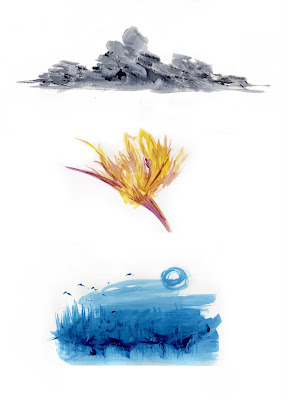 These are some of the byproducts of paint used for the first couple of color workshop homework we have had in class. The grey was from the greyscale project; the yellow and violet was for the complementary color project; and, the blue was for the blue-green project. I'm happy to report the ingenuity which sparked my swooshing of the brushes to achieve these monochromatic works. Homework paint's second life begets clouds, a dancing ballerina, and a moonlit path through the woods.
Thursday, March 4, 2010
True Colors

You know, I don't think we realize just how much color helps us. They tell us things. They do.
You can tell if the food you're cooking is ready to eat when it changes color. Meat turns from pink to golden brown, and you know you're going to have a nice satisfying meal. Or when a fruit's ripe, you know it when it changes color. If those mangoes are still green, that means you're in for a sour awakening if you try to eat them too soon. If you get a bruise on your leg, it turns blue-violet. That color's telling you to make sure that area doesn't get banged up again, or else it's going to hurt.
If you're swimming out to sea, and the water changes from light blue to royal blue, that means that you might not be able to touch the ocean floor and keep your head above water at the same time. Or if you talk to someone and see that her eyes are red, that may mean either she's got colds or she had been crying.
So watch out for color. Because it watches out for you.
Tuesday, March 2, 2010
The Color of Paradise
Where are you Blue-Green?
I can't find any blue-green in the city! Help me! If you see any, please tell me!
Blue-Green Sampling
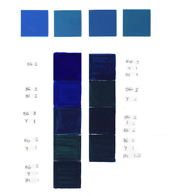
Note: I experimented testing mixtures to create hues that are associated with my assigned color Blue Green. BG stands for Blue Green, which is an existing pigment I have from Guerra. Y stands for Azo Fgl, another pigment from Guerra, which really is just yellow. and BI stands for Binder, which I chose to be the Silica Flat. I didn't know until after class that I can (and really should have) use white (Golden Fluid Acrylic) to open up the darkness of the samples I made, and see what the colors really were trying to be.
In the end, for the tinting project, I selected the swatch on the Right column, Top square, with the code BG-3, Y-1, BI-1.
Blue-Green Tinting
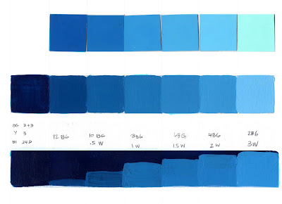
BLUE GREEN
Top Row: Coloraid Hue, T1, T2, T3, T4, LT
Middle Row: Guerra Pigment Mixture
Bottom Row: Reinterpretation of Tint and Shade Balance
Formulae
To get Row 2, Square 1:
Combine
Blue Green = (3Drops) + (3Drops)
Yellow = (3Drops)
Binder = 24D
To get Row 2, Square 2:
Combine
Blue Green = 12D
White = speck or .25D
To get Row 2, Square 3:
Combine
Blue Green = 10D
White = .5D
To get Row 2, Square 7:
Combine
Blue Green = 2D
White = 3D
Combine
Blue Green = (3Drops) + (3Drops)
Yellow = (3Drops)
Binder = 24D
To get Row 2, Square 2:
Combine
Blue Green = 12D
White = speck or .25D
To get Row 2, Square 3:
Combine
Blue Green = 10D
White = .5D
To get Row 2, Square 7:
Combine
Blue Green = 2D
White = 3D
Note: I used Guerra Paint to achieve the Blue Green mixture, but for the white, I used the Golden Fluid Acrylic. I'm not sure if I should mix these two brands or medium together because the Fluid Acrylic is thicker and more full-bodied already. I didn't add a lot of white to achieve the LT (Lightest Tint) of Blue Green, to compensate for the existing opacity of the paint.
Observation: Not obvious in this scan is the fact that the Coloraid row is a tinge yellower than the Paint mixture row. I didn't bother adding yellow into the mixture to really mirror the Coloraid swatch because the task is really an exercise in tinting - applying light/white onto a color/pure hue.
Rationale for Reinterpretation: I reinterpreted the tints in an ascending staircase manner instead of a descending one in our teacher's blog because 1) I didn't want to mimick the homework that was already done for us on the class blog; and, 2) because it makes more sense to me that the light will rise from a sort of horizon, instead of falling down from the sky. (And here I go again being poetic) I think that light will move just like temperature does. And since it is synonymous to warmth (the brighter something is, the warmer it must be, like an actual flame), then I figure that light, just like hot air, rises.
Subscribe to:
Comments (Atom)


