Monday, March 29, 2010
Pitter-Patterns
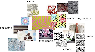
Here's a website that acts like an image database of print patterns that one can buy, or one can upload to and sell!
I found my homework answers right here, too.
1 - inspired by nature, but chaotic and random in print, click here.
2 - geometric pattern, (very Albers, too) click here.
3 - photographic, freeform or based in type, 2 patterns together, kaleidoscopic, click here.
Monday, March 22, 2010
The Next Secret Weapon
Maybe we should develop a Crayola bomb as our next secret weapon.
A happiness weapon. A beauty bomb.
And every time a crisis developed, we would launch one.
It would explode high in the air - explode softly
- and send thousands, millions, of little parachutes into the air.
Floating down to earth - boxes of Crayolas.
And we wouldn't go cheap, either - not little boxes of eight.
Boxes of sixty-four, with the sharpener built right in.
With silver and gold and copper, magenta and peach
and lime, amber and umber and all the rest.
And people would smile and get a little funny look on their faces
and cover the world with imagination.
Robert Fulghum
What Will It Be?

The essence of the blue-green that I want to put forth in the book is really about paradise. The story that I wove before was about a moment that took place in a kind of "paradise". And, all the photos that I've been lucky to find in the net are of the beach, whether it was taken professionally (or with a professional camera) or a polaroid (which when kept for a long time fades to either cyan, magenta or yellow, depending on the percentage of color used).
I don't want the book to be a series of just beaches. I want to capture what paradise means. Is it always just about the water? Can it be about an object? A picture? A person?
This is where I am at, and I'm confused. Maybe I should just toss a coin.
Catching the Blues (Blue Greens)
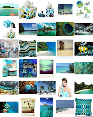
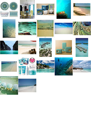 This is one collection of the blue-greens in images I've mined on the net. Unfortunately, and frustratingly enough, there are not a lot of blue-greens around in real life (here in the city) yet. There is cyan, though, but I have been holding out on a combination of blue and green. I see it fleetingly on a scarf, or a shirt, or a bag, or a beauty product, or a salt shaker. They don't evoke the blue-green essence that I want to capture - paradise.
 The concepts swimming in my mind for my color book are:
paradise
forgotten paradise
untold paradise
secret paradise
captured paradise
exotica
hidden exotica
secret waters
quench
waters of eden
eden
liquid eden
exotique
secret exotic
Photo Paletting: Actually, It is Rocket Science
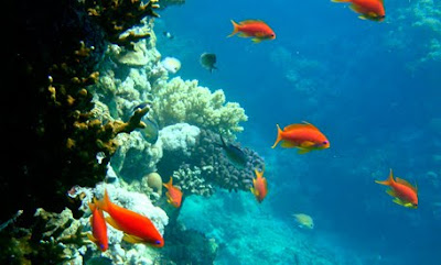
The original photograph
with my signature color Blue Green.
So I started out with my photograph. I selected an image that was composed of my signature hue but also included a contrasting (complementary) color.
I followed all of the suggestions to simplify photos and group colors, so that the color palette based on the photograph would be more evident.
The Median output seemed to make the colors coagulate the best. I thought at first that a Mosaic treatment or even a Crystallize treatment would separate the colors better, which they did, but the separation created so many tints, tones and shades in between, and I don't want to go crazy manually noting down the color codes of each square or fragment.
From the color separation done in Photoshop, I went to the more hands-on task of calculating the proportions of the most distinct colors in the image in Illustrator.
Here's what I did:
1) I set guides on the edges of the image, breaking it afterwards in halves, and plotting the guidelines there accordingly.
2) Then, I assigned a spectrum of greys and recreated the same plane using a square as the smallest unit of measure.
3) Since I have two colors occupying 50% of the picture, and nearly 25% of the picture, I simply divided 25 into 8 to determine what percentage a square occupies. One square is 3.125%.
4) I enumerated the rest of the proportions based on the types of shapes formed: a square, a half-square (triangle), two squares, three squares.
5) Then, I represented the %'s in a strip and in circles, scaling them according to the numbers I obtained.
Who knew that the way to arrive at this artistic representation is by using the scientific method? Thank God I listened to my high school teacher.
Subscribe to:
Posts (Atom)


