Wednesday, February 24, 2010
The Color Name Game

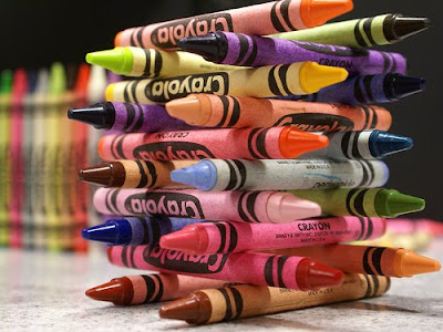
It may be Crayola's fault. It's totally self-indulgence. Why did it have to go make crayons past the "basic eight" (I just named it like that)?
Now we have just too many names, like:
I mean, color did add color to color-naming, I can tell you that.
P.S. And just as an aside, I guess it was better to name a color than just compare it and say colorer than color. Because then, we'd just have two degrees of a hue, and that just ain't enough.
What's Wrong with Pink?
A pair of mothers in the U.K. choose to hate pink. In fact, they call themselves "Pinkstinks." It's all about gender-typing, discriminating, wrongful advocating...(and a lot of negative energy). Honestly, people, you can use a little pink in your lives.
Pink is a color. Colors aren't bad. Kids love color. Sometime ago one person mixed their colors and created pink. It's already here in the world. It's our option to wear pink. It's our option to own pink.
So, chill. We have pink built in to us biologically. I mean, just try calling your little finger or little toe something else.... it just won't work.
Colorbots
 Another way to recycle ink cartridges: turn them into mini-robots like these! My eyes have only just been opened. Too bad this was part of the MoMa exhibit in 2008. Can't hurt to look back at the past though.
On a similar note, (of looking back), here's an interesting flash invite of sorts for that Moma Reinventing Color Exhibit.
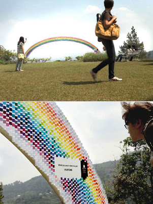
What's a Rainbow Made Of?

Check out what Pantone did as a way to advertise their product! How cool is it that they get to "sell" the idea of color? You have everything imaginative in your fingertips - nature, dreams, fantasy, magic. I think they can even do a guerilla marketing scheme springing from this installation: they can create rainbows all over town, and brand it Pantone! (I'm copyrighting that idea right now.)
Tuesday, February 16, 2010
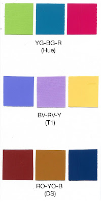
Newly Born: Split Complementary Swatches

Top Row: It's the color palette for that H&M Resort Collection of Matthew Williamson!
Middle Row: Oh, this is my cupcake balloon at Central Park palette!
Bottom Row: And, strangely, this is also my "Deep Fried Guilt and Water" palette!
P.S. I didn't recycle these ideas! I just thought I'd have a study in red, yellow and blue!
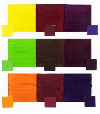
Complementary Colors Combined
 For my primary complementary pair, I selected Yellow and Violet, which when combined together produces a warm Brown.
It was hard to get the right Violet with the pigments I got from Guerra Paint, simply because I think the red we got was nearly vermillion-y. I added a little hint of magenta to cool the red down a bit, and then added the blue which was thankfully reliable.
Moving onto the tertiary colors got me mixing Yellow and Green to produce the Yellow-Green hue, which is spot on to the Color-aid swatch, yay! I had the help of both red and magenta to produce a Red-Violet hue to complement it. And then, when I mixed them together, I got a very damp looking soil kind of brown. Very dark olive.
And then, finally, I mixed Yellow and Red first, and then added more Yellow to produce the third tertiary pair. I was really satisfied with the Blue-Violet that I produced. It was rich, and opaque, and felt more solid and stable. Of course the middle boxes are meant to be experimental, but it was worrying me not to know what color I should wait for the mixture to be.
It was surprising to find out that the mixtures of these complements are the way they are. My stock knowledge of color harmonies end with pairs. I don't do threesomes, basically. :P I'm glad I finally got to know how to find the third color in these pairs! It gives the harmony a really interesting twist.
Subscribe to:
Posts (Atom)