Monday, February 15, 2010

Project I: Blue Green


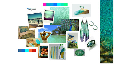
BLUE GREEN (turquoise, teal, cyan, aqua, or aquamarine)


The combination of blue and green adds dimension to their base colors, thereby expanding the effects they have over our perception. Blue connotes the sky, and green is associated with grass or land. Combining the two represents where the two meet, which is water.

Called by other names like turquoise, teal, cyan, aqua or aquamarine, blue-green is used in a spectrum of industries – from fashion, interior design, to wellness, R&R, travel, in healthcare, hotel, technology and corporate settings. It’s also used in sports like hockey, football, baseball and basketball.

Turquoise is the symbol of youth, and high ideals. It is refreshing and sophisticated. It can be trendy or dated depending on the colors that it is combined with. It is sweet, and feminine. McInnis and Shearer (1964) found that blue green was more favored among women than men. As it gets darker it becomes more worldly and sophisticated.It contains both the quality of growth or life from the green, and the quality of intelligence and communication from the blue.

Blue-green as a color is also prominent in West European Old civilizations (Celts, Pictons, Neolithics, Irish, Breton). They paint their bodies with it. Their language only has one term to refer to blue and green – “glas”. A lot of areas in West European countries are called names that mean green or blue-green i.e. Glastonbury, Glasgow. Blue-green is also a sacred color in Iran, where it symbolizes paradise. It is associated with ancient civilizations, the New Age and with the zodiac sign Aquarius.

As a gemstone, turquoise has been used in amulets to provide protection, health, confidence and strength. In terms of location, turquoise is associated with the Middle East and American Southwest. Turquoise can calm hyperactive or hypersensitive people. It is meant to treat disillusionment, apathy, breathing issues, physical detox, rebirthing, purification, sterilization, to kill pain. It generally heals and improves circulation and reenergizes.

Teal is a medium blue-green color. It gets its name from a type of duck, with that color surrounding its eyes. Teal is one of the 16 web colors formulated in 1987. Teal belongs to the system called Plochere Color System, formulated in 1948, which is used by most interior designers on which to base their color palette decisions. Teal is the default background color in Windows 95. In an online vote, it was also voted the most popular shade of blue above cornflower blue.

Blue-green represents feeling and creative expression more than rational thought. It relates to transformation, evolution, change, sharing, waves, metamorphosis, transmutation, the inner teacher, and the spiritual heart – midway between the heart and the throat. These family of colors also associate with mystics, telepathy, a symbol of both heavens and the sea, of fluid movement and mutability. As a chakra, “Thymus Chakra”, it connects us with energies of spiritual love and mystical coomunion and the Divine as teacher and as Sacred Lover and beloved. Blue-Green indicates a dreamy person, emotional, a thinker than a doer, insightful, perceptive, someone who sees possibilities.


PANTONE PR

Blue-green is the color of the year according to Pantone. It takes us to an exciting, tropical paradise, and still gives us a sense of protection and healing. It takes us away from the stresses of the world, and invigorates us by surrounding us with the calming seascape.


Thursday, February 11, 2010

Color Quote of the Week - P.P.


Why do two colors, put one next to the other, sing?
Can one really explain this? No.

Pablo Picasso


Color Quote for the Week


Color is my day-long obsession, joy and torment.
Claude Monet

Deep Fried Guilt and Water

I call this:
"Deep Fried Guilt and Water"

with its permutations


It's also in kuler.adobe.com.


My eyes fell on the first thing in my room - fried food.
The water was for my penance.


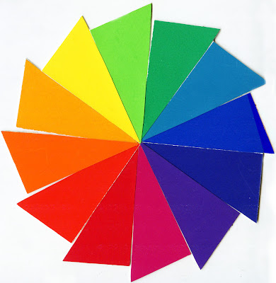
Reinventing the (Color) Wheel

I did my version of a color wheel based on a pinwheel! (and also to make it easier for me to put it together) Quite proud of my work, despite starting out too ambitious (24 colors even though we were only requested to do 12).

The color theorist and model I selected for my presentation this week was Faber Birren. The guy was responsible for the red you see in stop signs, the yellow you run over (in humps and yields), and the orange in the cones you steal off the highways (and in danger signs). Who knew that a guy who studies color would have the Army and the Navy for its clients? Very impressive.

You know, he started out looking to emulate his father in becoming a landscape painter himself? He soon realized that his expertise in that regard fell short. It's comforting to know that sometimes the things you're not good at actually lead you to be the best person you can be somewhere else.

I love his triangles. I love that he made it easy to understand how we can expand color from the basic ones you find in your Crayola box of 8, to the mega-Crayola bleacher type of box (you know that kind? I always wanted one of those when I was a kid but never really got it)! It's all about the tints, tones and shades, baby. And I'm not talking about the tints in one's car that makes two people get away with something. Or the shades cool people wear in clubs at night. I'm talking pure hue + white = tint. Pure hue + black = shade. Pure hue + mixture of black and white = tone.

My analogy for describing his color model is a billiard table. The circles are the balls, and you know they have to set it up within a triangular thing before you start hitting the ball with the stick... Anyway, before I go too pool-talk-savvy (not really), the main thing is to realize that colors are harmonious when they follow the connections of the straight lines that Birren made, which is just like when you strike a ball and you make an imaginary line from that to the ball you really want to put in the hole. I'll stop before I hurt the ears of someone who knows billiard talk.

Tuesday, February 9, 2010

Painterly Matters


I made a trip out with classmates to Guerra Paint on 13th and Avenue A after class today and have never been drawn to color as much as I was when I walked in. On one wall of the store were all these strips of paint in their various permutations (with a thickener, with a metallic compound, etc.). It was cool of one of the store personnel to explain the difference and to demonstrate the effects of solutions to the pigment to create depth and texture to a hue. Bottom line is: in painting, it's not just about hue. It's what you do with the hue. Do you want to make it glossy, or make it matte? Do you want to thin it out, to show the canvas underneath or do you want to thicken it and create peaks? Do you want to add other media into it - glitter, glass beads, rubber tire tracks (apparently so)...? Painting is really about construction. And while it's outwardly artistic, it's really also existentially scientific. You have to know how pigments interact with solvents, with media, and then you make the call.

Monday, February 8, 2010

Analogous in the City


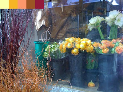
Flowers on Sale
Tints, Shades & Temperatures: Cool Yellow (T), Warm Yellow (T), Yellow (T),
Orange (T)(P), Red (S)
The colors are natural, and evoke a sense of life cycle - from a young bud to a mature stem.


Apartments in my Neighborhood
Tints & Temperatures: Warm Red (T), Red-Orange (P), Red (P)
The colors are mute and softened, like they've been worn down by the elements. They remind me of brick and paint that's been standing for a long period of time.


Balloons in Central Park
Tints & Pastels: Yellow (T), Blue-Violet (T), Violet (T), Cyan (T), Red (P)
The colors are light, delicate and airy. You can almost taste the sweetness of the colors.